Korean Nail Marketing: How K-Beauty Brands Turn Colors into Cravings
BeauticsLab
August 15, 2025

Table of Contents
"I'll Have a Lemon Sorbet Nail Polish, Please"🔗
Sound absurd? Not in Korea. Tiptoe, one of Korea's leading nail brands, actually names their colors 'Sugar Pop', 'Lemon Sorbet', and 'Bubble Gum'.
Welcome to the fascinating world of K-beauty nail marketing, where color naming has become a sophisticated psychological game. Our analysis of Olive Young's top 4 nail brands in Week 32 of 2025 reveals how Korean brands are revolutionizing the way we think about nail polish.
The Players: Week 32's Top Korean Nail Innovations🔗
- Tiptoe Color Nail Polish - Dessert & Music Fusion
- Portre Nail Nouveau Jus - French Luxury Appeal
- Dear.A Shine On Me Nail - Emotional Connections
- Wakemake Nail Gun - Texture & Season Focus
1. Tiptoe: Making Nail Polish Edible🔗
🍰 The Dessert Strategy🔗
Tiptoe Color Nail Polish Product Page Story Flow
Summer Edition Launch
Sugar Pop, Lemon Sorbet, Bubble Gum - A dessert collection for summer
Musical Texture Classification
Andante (syrup finish), Giocoso&Allegro (glitter), Guisto (full color)
Sensory Descriptions
Sparkling like pop candy, strawberry syrup blended with fresh glitter
Tiptoe employs sensory marketing at its finest, transforming visual information (colors) into taste sensations (desserts).
- Sour Strawberry: Pink that makes your mouth water
- Plum Syrup: Deep purple reminiscent of preserved plums
- Nougat Beige: Sweet, creamy beige like nougat chocolate
What's even more intriguing is their use of musical terminology for texture classification. Andante represents slow, lyrical syrup finishes, while Allegro indicates lively glitter formulas.
2. Portre: The French Connection🔗
🇫🇷 Luxury Through Language🔗
Portre Nail Nouveau Jus Product Page Story Flow
LA POMME (La Pomme)
Apple - Red reminiscent of apple orchards in French gardens
VIN ROSÉ (Vin Rosé)
Rosé Wine - Elegant pink from southern French vineyards
OLIVIÉE (Oliviée)
Olive - Mediterranean green from olive groves
LE CIEL (Le Ciel)
Sky - Blue like clear Parisian skies
ÉDITION System
1ST EDITION, 2ND EDITION - Creating a limited collection feel
Portre names every color in French, with 1ST EDITION and 2ND EDITION divisions creating a collector's item atmosphere. Even basic descriptions maintain elegance: "Cream Beige", "Chocolate Brown", "Deep Burgundy".
3. Dear.A: Colors with Feelings🔗
💝 Emotional Color Naming🔗
While emphasizing vegan certification throughout their product pages (mentioned 29 times!), Dear.A takes an emotional approach to color naming.
Dear.A Shine On Me Nail Color Product Page Story Flow
Hug Me Tight
A warm beige that makes you want to embrace
Crush
Purple hues of a heart-fluttering crush
Intimate
Mysterious and attractive mauve tone
Cranberry Cheer
Red filled with winter's cheer and vitality
The brand balances systematic SE01-SE35 coding with emotionally evocative names, creating both organization and connection.
4. Wakemake: Seasonal Curation & Texture🔗
🎨 Systematic Seasonal Organization🔗
Wakemake Nail Gun Product Page Story Flow
Spring Season
Dewy, Pale, Known, Mute - Texture-focused spring collection
Fall Season
Dawn Nuance, Roasting Autumn, Blushed Plie, Rose Bunch
Daily Collection
Pink Grape, Flat Peach, Peony Dew, Hibiscus, Ballet Tutu
Tone Classification
Cool/Warm/Neutral tone indicators for personal color matching
Wakemake takes the most practical approach:
- Texture descriptors: Dewy (moist), Pale (light), Mute (subdued)
- Seasonal categories: Spring/Fall/Daily for clear organization
- Tone guides: Cool/Warm/Neutral indicators on each color
The Psychology Behind K-Beauty Color Naming🔗
Target Audience Analysis🔗

| Brand | Naming Strategy | Target Audience | Purchase Psychology |
|---|---|---|---|
| Tiptoe | Desserts/Music | Gen Z (10-20s) | "Fun and cute!" |
| Portre | French Language | Premium-oriented customers | "Luxurious and special" |
| Dear.A | Emotions | Emotionally-driven (20-30s) | "Relatable and warm" |
| Wakemake | Texture/Season | Practical shoppers (all ages) | "Accurate and reliable" |
The Hidden Strategies in Color Naming🔗

1. The Power of Sensory Transfer🔗
Tiptoe's strategy of making nail polish "edible" leverages Sensory Transfer. Converting visual information (color) to taste (dessert) creates more memorable impressions.
2. Linguistic Premium Effect🔗
Portre's French naming exploits the Linguistic Premium effect. The same red appears more expensive as "VIN ROSÉ" than as "Red" or even "Rouge."
3. Emotional Connection Points🔗
Dear.A's emotion naming is pure Emotional Branding. Connecting colors with feelings transforms products into tools for self-expression.
4. Practical Trust Building🔗
Wakemake's systematic classification provides Cognitive Convenience. Clear information reduces purchase decision burden.
Marketing Insights for Global Brands🔗

A single color name can determine brand identity.
Nail polish is ultimately about selling 'color'. How you name that color defines your brand positioning:
- Want to sell fun? → Go dessert-themed like Tiptoe
- Want luxury appeal? → Use French like Portre
- Want emotional connection? → Express feelings like Dear.A
- Want trust? → Be precise like Wakemake
What Western Brands Can Learn🔗
Korean nail brands demonstrate that color naming isn't just labeling—it's storytelling. While Western brands often stick to descriptive names (Cherry Red, Ocean Blue) or abstract numbers (#123), K-beauty brands create entire worlds around their colors.
This approach has helped Korean beauty brands achieve remarkable success in the global market. By understanding these strategies, international brands can better compete in the increasingly sophisticated beauty market where emotional connection often trumps product features.
The Bottom Line: Color naming is the language through which brands communicate with customers.
Making nail polish "edible" or "huggable" might seem unusual, but it all starts with a name. What language is your brand speaking?
Key Takeaways for International Marketers🔗
- Sensory crossover creates memorability - Don't limit yourself to visual descriptors
- Language choice affects perceived value - Foreign languages can add premium appeal
- Emotional connections drive loyalty - Names that evoke feelings create stronger bonds
- Clear categorization reduces friction - Help customers find their perfect match easily
The Korean beauty industry's innovative approach to something as simple as color naming shows that every detail matters in creating a compelling brand story. In a market where products are increasingly similar, the story you tell—starting with the name—makes all the difference.
Related Articles
Discover more insights on similar topics.
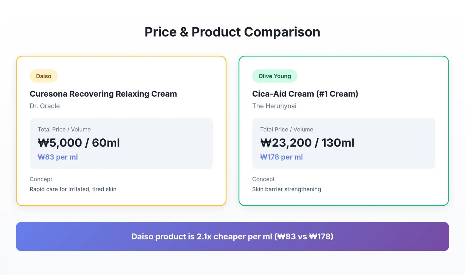
Korean Cica Cream Marketing: How 4 Key Ingredients Challenge Premium Pricing
Analysis of Dr. Oracle Curesona Cream (5,000 won) vs The Haruhynai Cica-Aid Cream (23,200 won) reveals how budget Korean cica creams include the same 4 key ingredients as premium products - strategies that redefine value propositions in K-beauty's soothing cream segment.
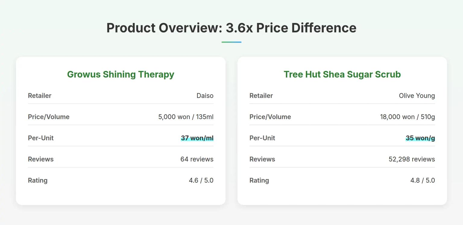
Korean Body Scrub Marketing: How LHA Changes the 5,000 Won Game
Analysis of Growus Shining Therapy Shimmer Body Scrub (5,000 won) vs Tree Hut Shea Sugar Scrub (18,000 won) reveals how Korean body scrub brands use chemical exfoliation ingredients to challenge physical scrub dominance - strategies that redefine value propositions in the budget beauty segment.
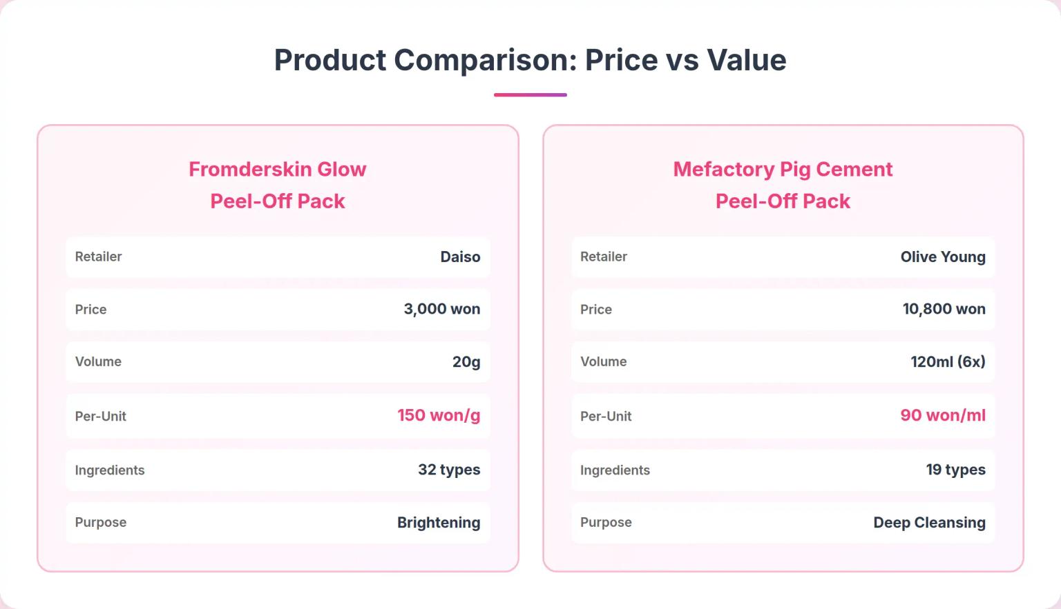
Korean Peel-Off Pack Marketing: Why Price Doesn't Tell the Full Story
Analysis of Fromderskin Glow Peel-Off Pack (3,000 won) vs Mefactory Pig Cement Peel-Off Pack (10,800 won) reveals how Korean skincare brands use ingredient positioning and skin type targeting to create distinct market segments - strategies that challenge conventional price-value assumptions.